Kianna's Wireframes
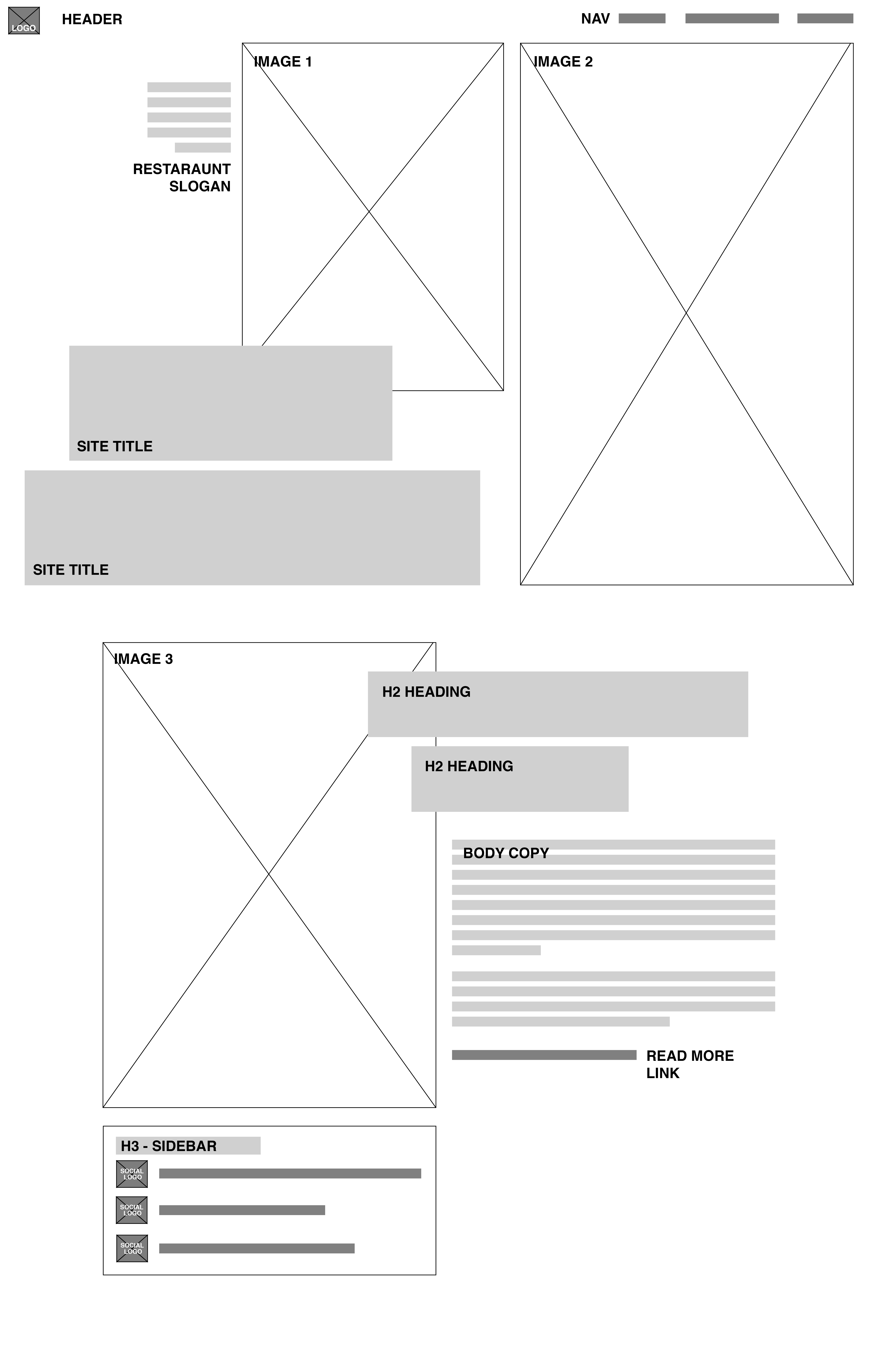
Desktop Wireframe

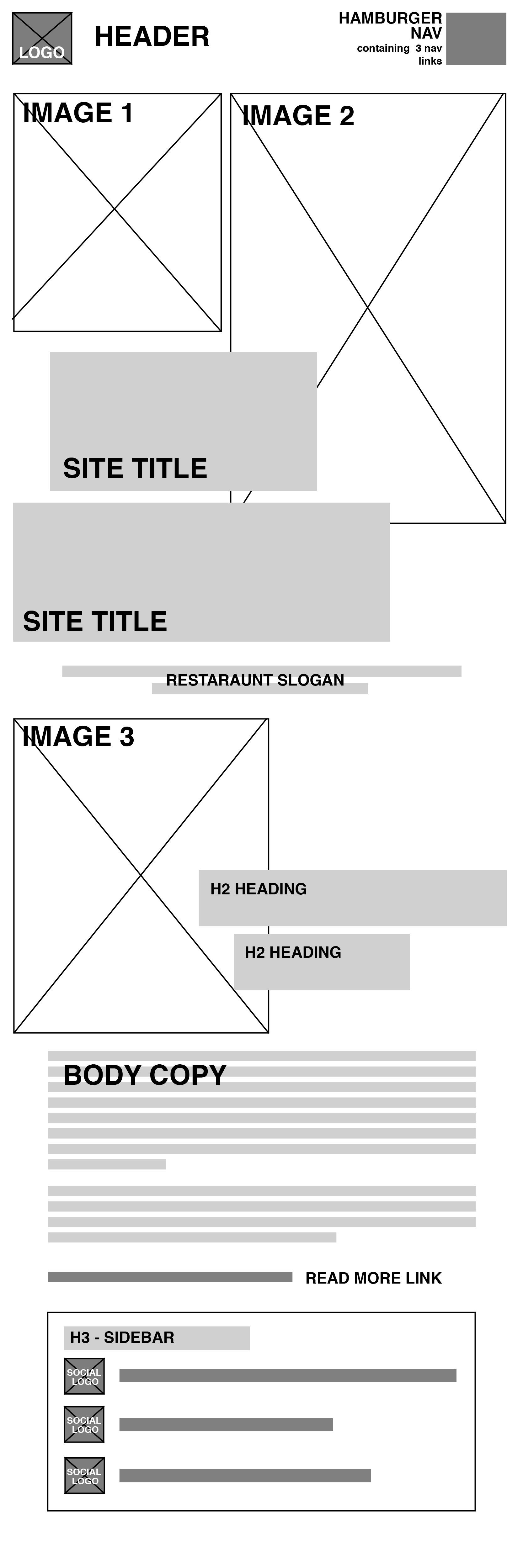
Several creative elements will be used to enhance this page to give the local restaraunt a modern, chic online feeling. To portray this, a mix of serif and sans-serif fonts will be used, potentially a heading serif font such as Didot, and a body sans-serif font such as Gotham. Gotham will give the page a modern look, while Didot will give the site personality and class. Overall, while Gotham will appear usually the same body text size throughout, Didot will be overly large, overlapping the picutres at times. This makes the site unique, and really sets it apart from other restaraunt webpages.
To add on to the modern look, the site will have a smaller, simple white header that contains a simple nav and the company's logo. Keeping the header and nav minimalistic will draw more attention to the food and the website's content.
The colour scheme for this site will be more muted, darker colours such as dark greens and burgundys to compliment the pictures. It is important not to have an overly bright colour scheme so as not to distract from the food and the information. Overall, this site will have more of a minimalist look, as the background will remain white to compliment the pictures. However, any important information, links or hover features will include some colours mentioned earlier to make the site more exciting.
Images of the restaraunt's best dishes will be used in order to give site visitors a feel for the restaraunt's type of cuisine and dining environment. These images will be edited similarily to give the site more coherence as the user scrolls down the page.
Mobile Wireframe
